Services
Work
Studio
Blog
Contact

Gigantic Media

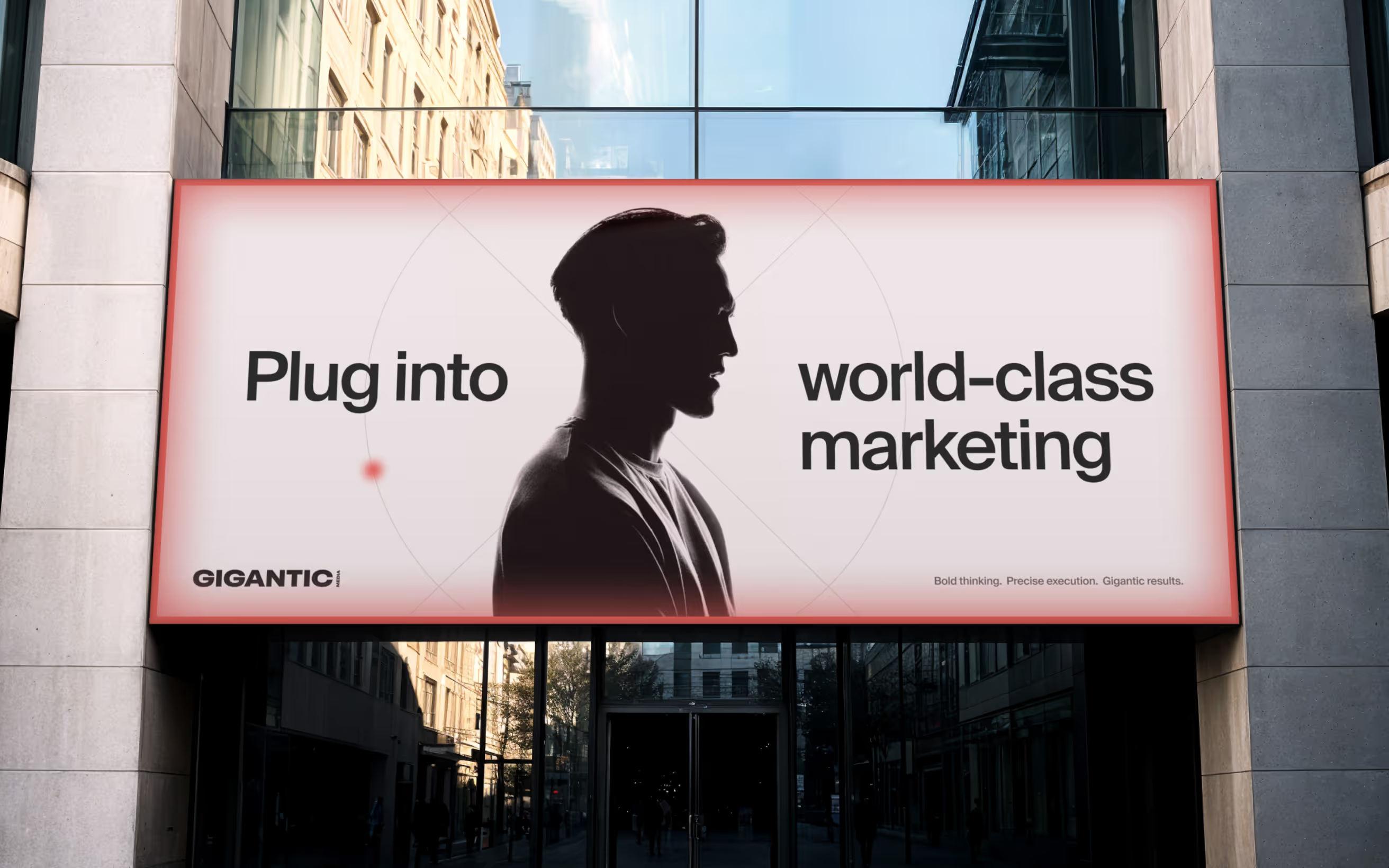
Branding and Web Design for a marketing agency that operates like a machine

Branding
Web Design
Gigantic Media needed a brand and website that reflected how they work: as an embedded team, fast, adaptable, and able to step in at any stage of a client’s growth. The brand needed to communicate reliability, precision, and unconventional thinking.

The idea

A marketing partner that works like a machine, ready to plug in at any time, in any configuration. A precise, dependable system designed to deliver results. A team engineered to perform. This idea became the foundation for the visual language, typography, motion, and website experience.

Logo

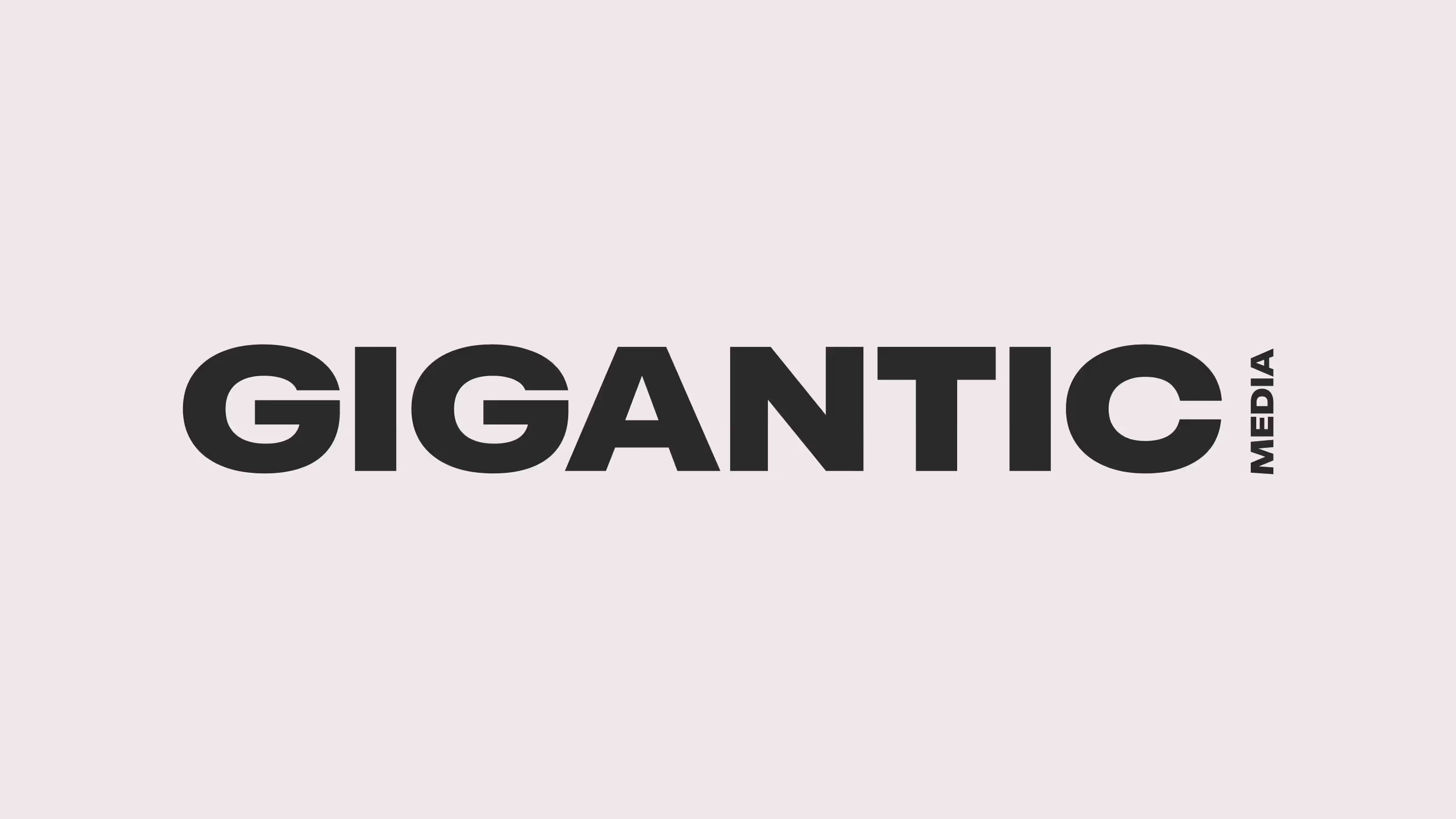
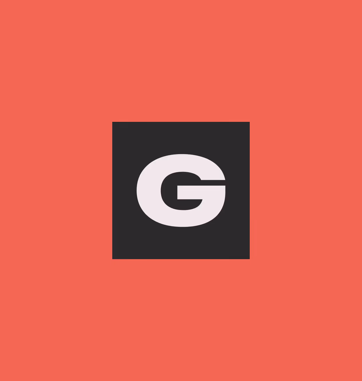
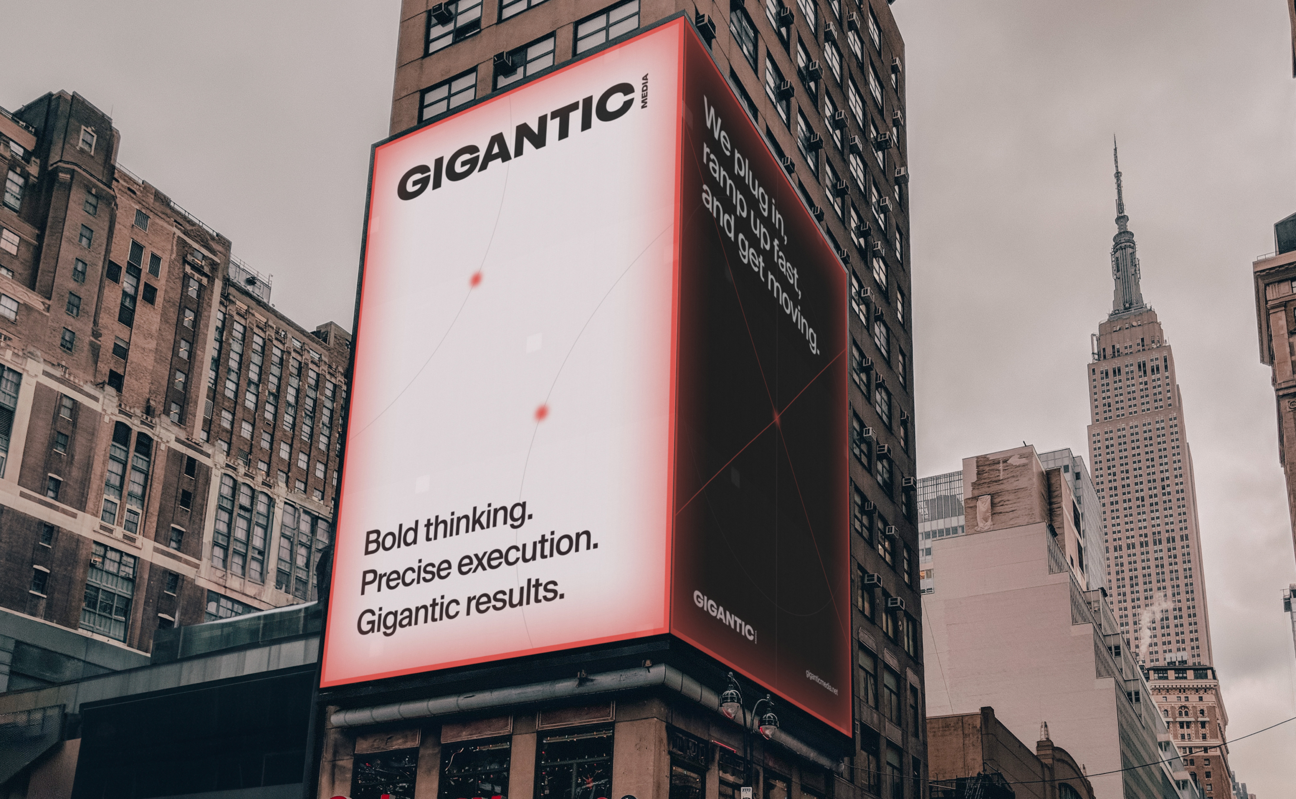
The logo reinforces the idea of scale and power. The word Gigantic is... well, gigantic. The word media appears smaller and attached, creating contrast and grounding the name in its industry. The main word carries the personality. This relationship between the two words reflects the brand essence: big ideas, executed with precision.

Typography

The typeface draws inspiration from Swiss design. It’s precise, rational, and engineered. Swiss typography carries a sense of neutrality and functionality, which aligns with the idea of a system that works reliably and efficiently. It reinforces the perception of Gigantic Media as structured, dependable, and serious about execution.

Color

The palette is intentionally restrained: Red, white, and shades of gray. Red provides energy and confidence. The rest reinforces the sense of discipline and control, like a machine designed to do its job perfectly.

Graphic Language

The graphic system is built from thin lines, geometric shape, and minimal compositions. These elements create the look of diagrams and structures that suggest engineered systems. It reinforces the idea of a marketing machine made of interchangeable parts working together.Occasionally, this precision is interrupted by subtle glitches in the lines. They introduce energy and unpredictability, hinting at the creative side of Gigantic Media.

Website experience

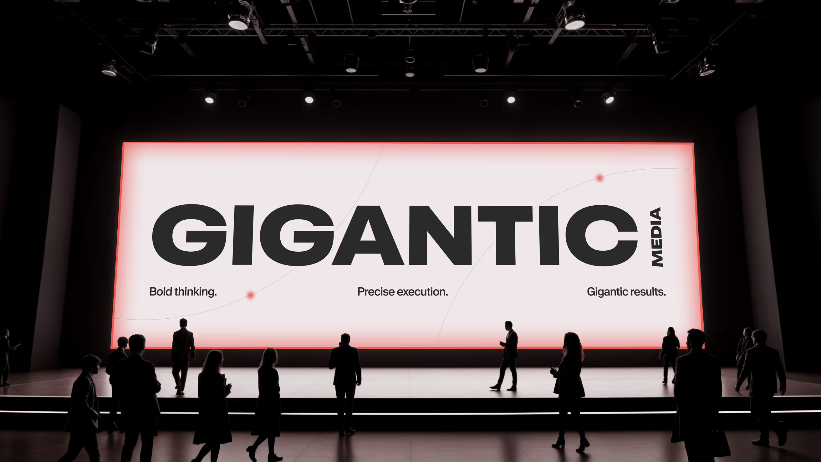
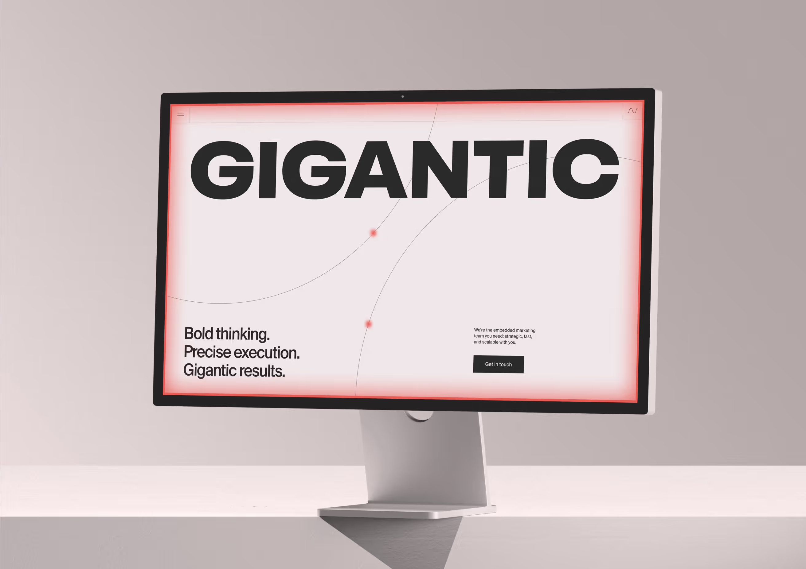
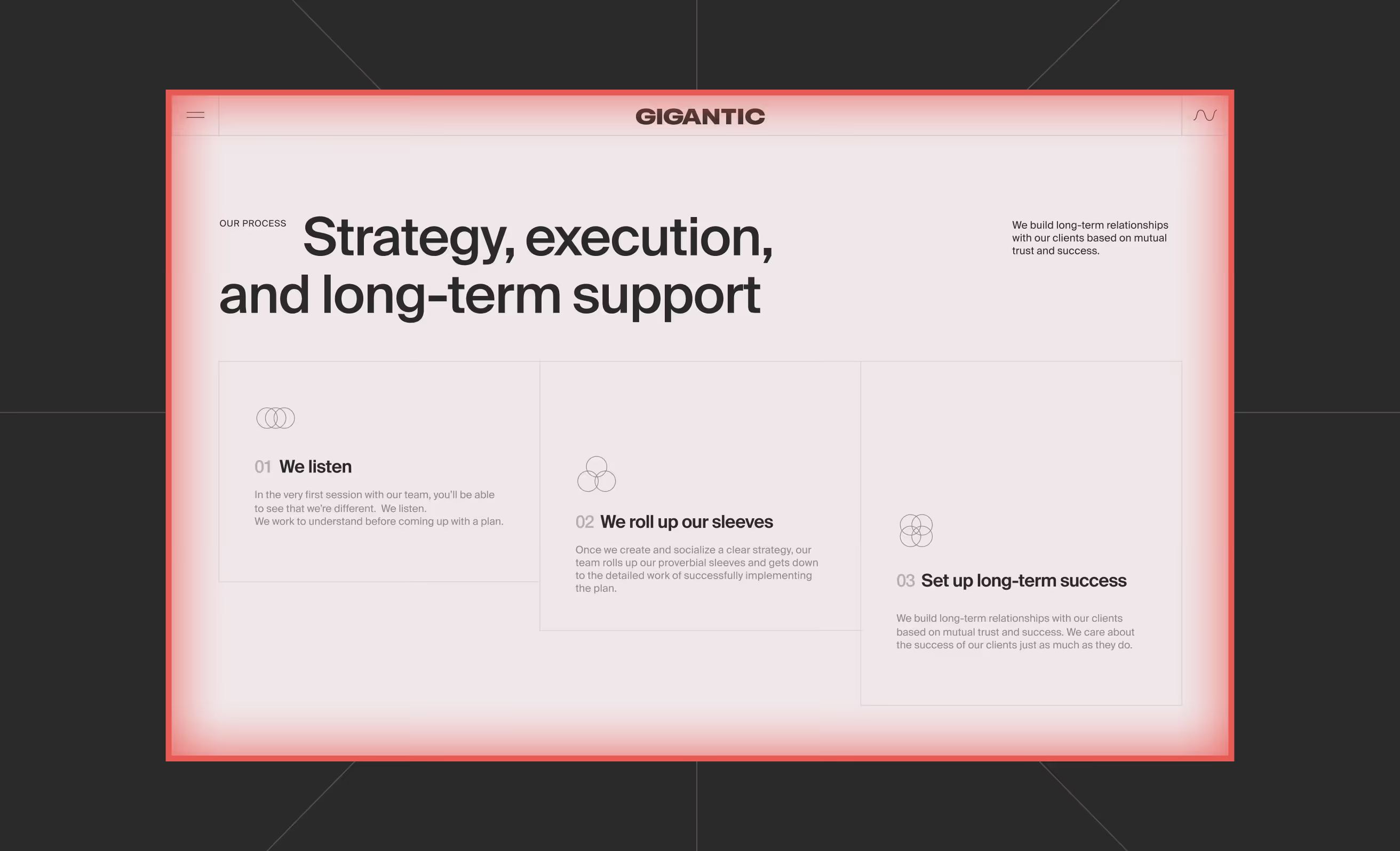
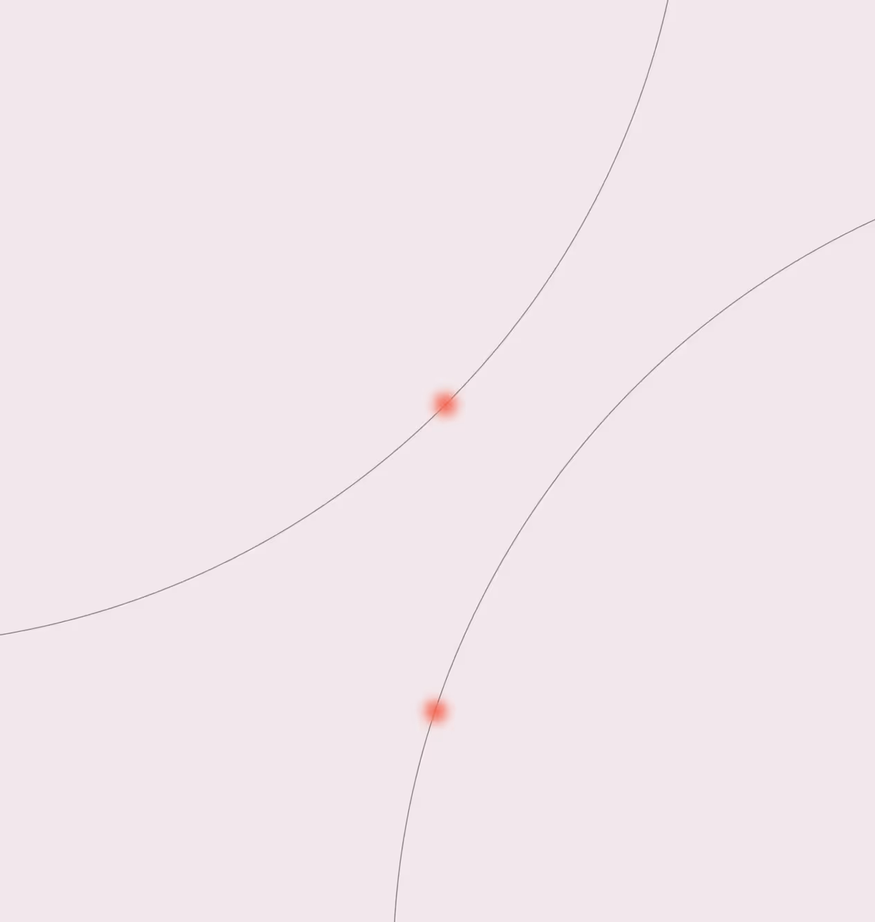
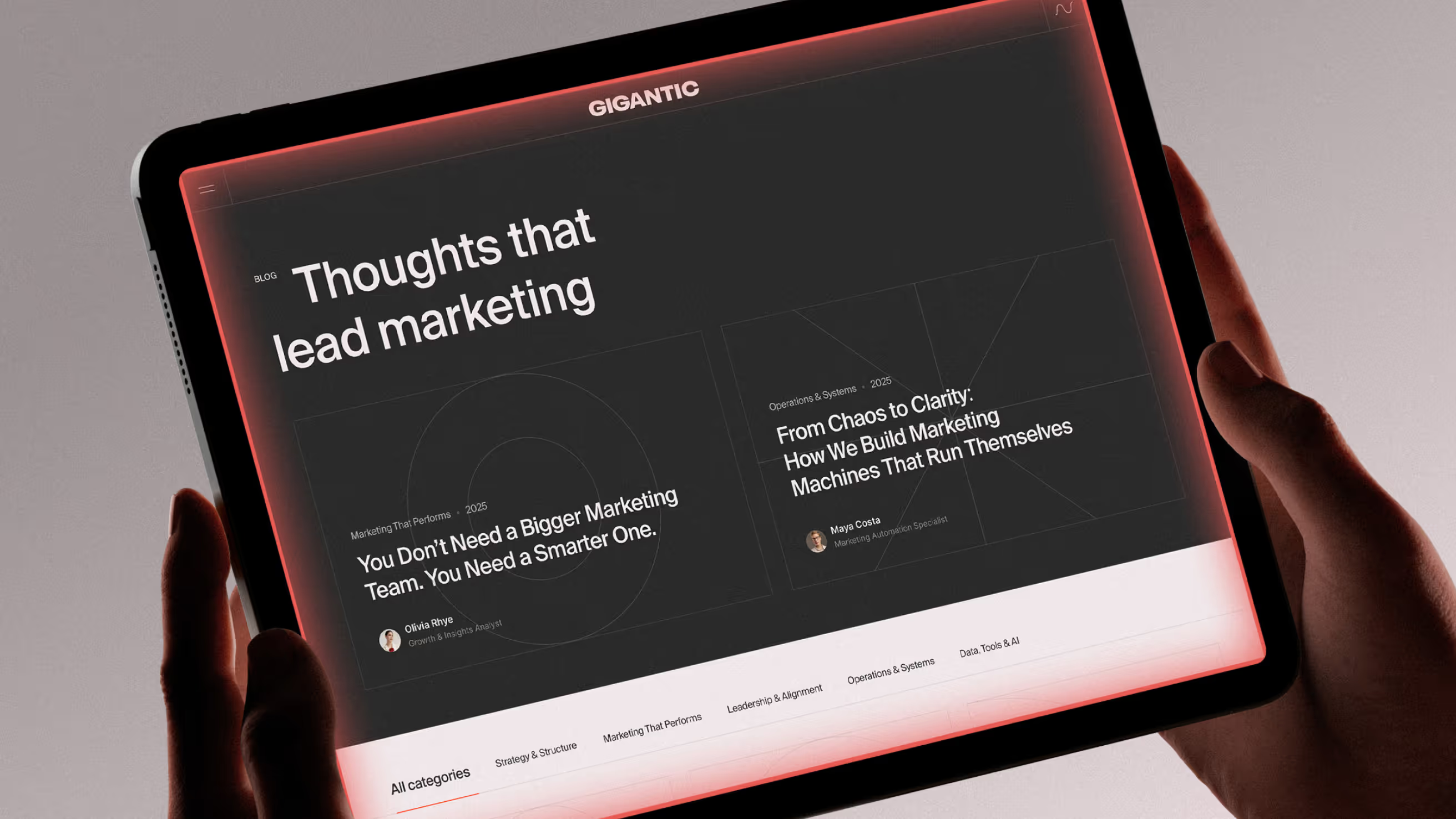
The interface behaves like a visible system in motion; a machine operating across pages. The goal was not just to present information, but to make visitors experience the idea of Gigantic as a working system. The result is a highly custom, digital experience that stands apart from conventional agency websites.

Mobile experience

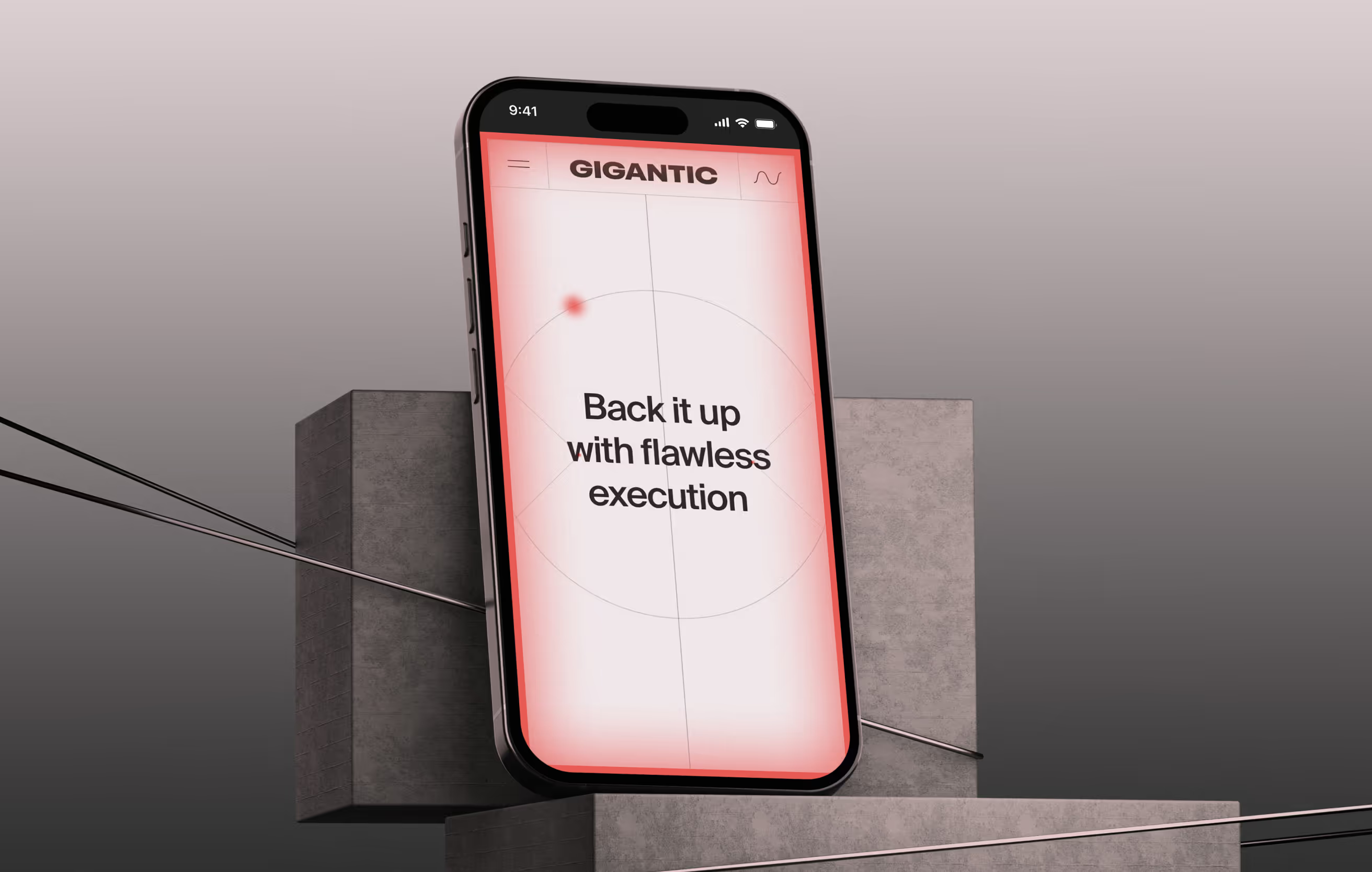
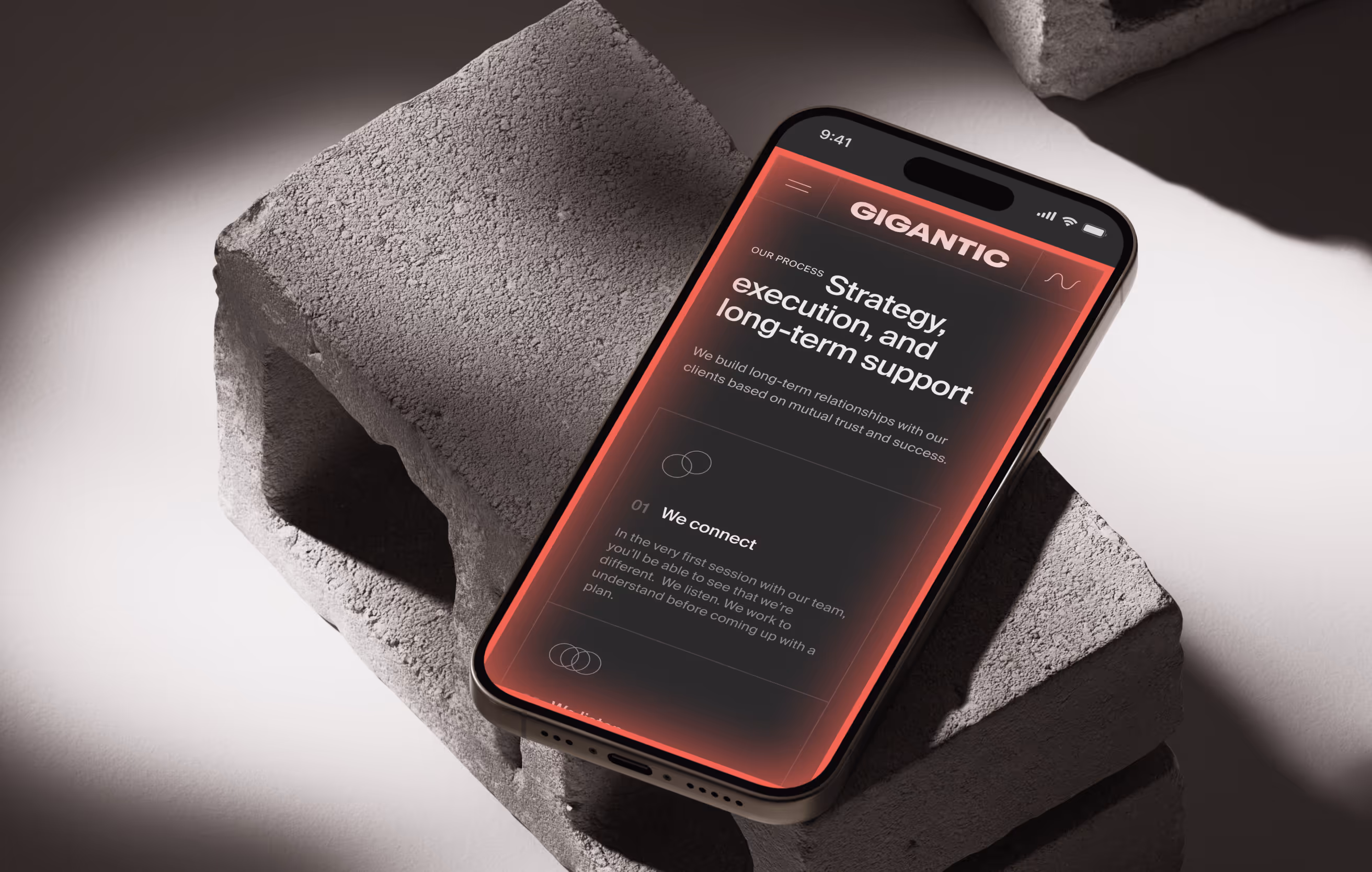
On mobile, the challenge was to preserve the personality of the desktop experience while making it faster and lighter. We simplified interactions, reduced motion where necessary, and adapted layouts to maintain performance without losing the identity of the system. The experience remains consistent, but optimized for speed and usability.
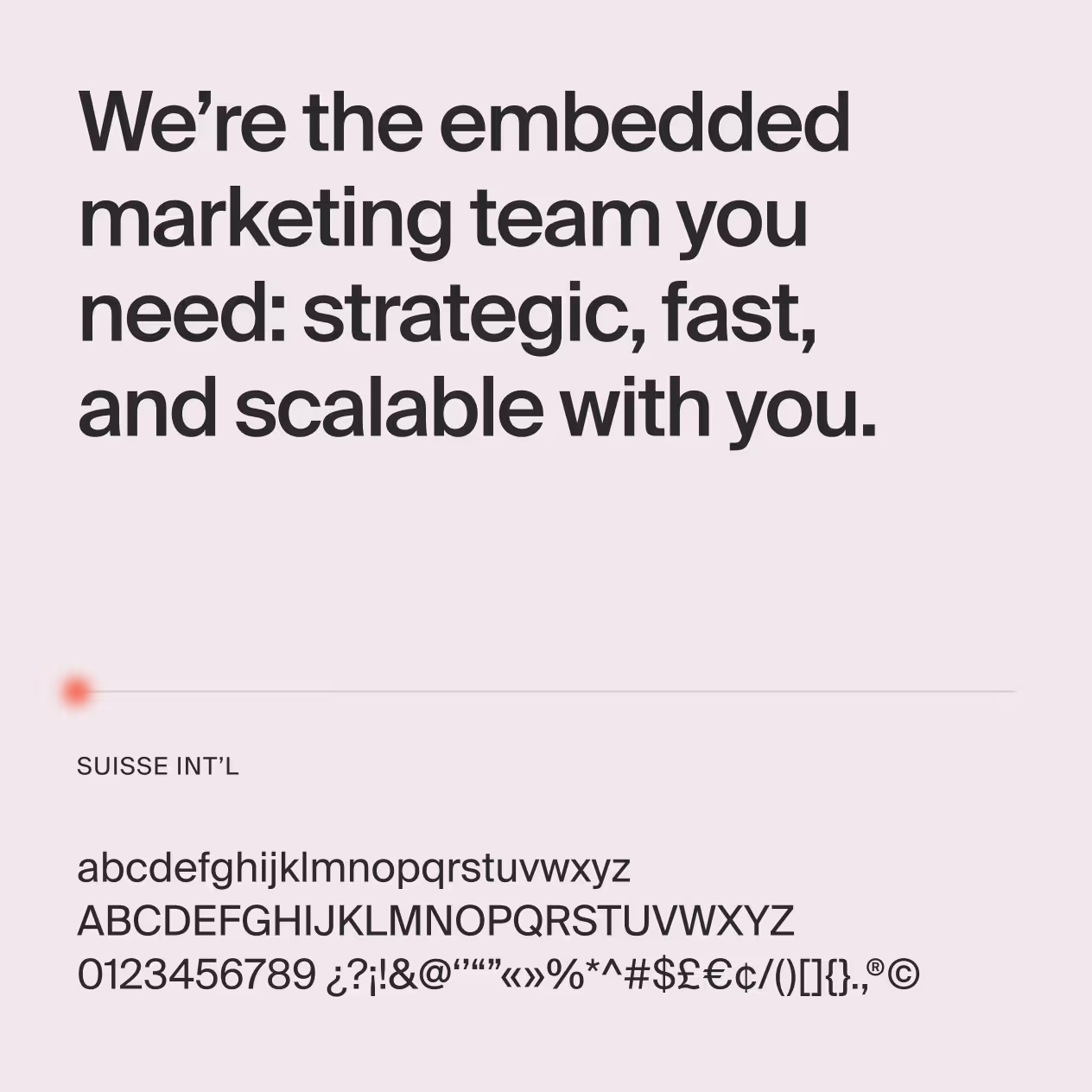
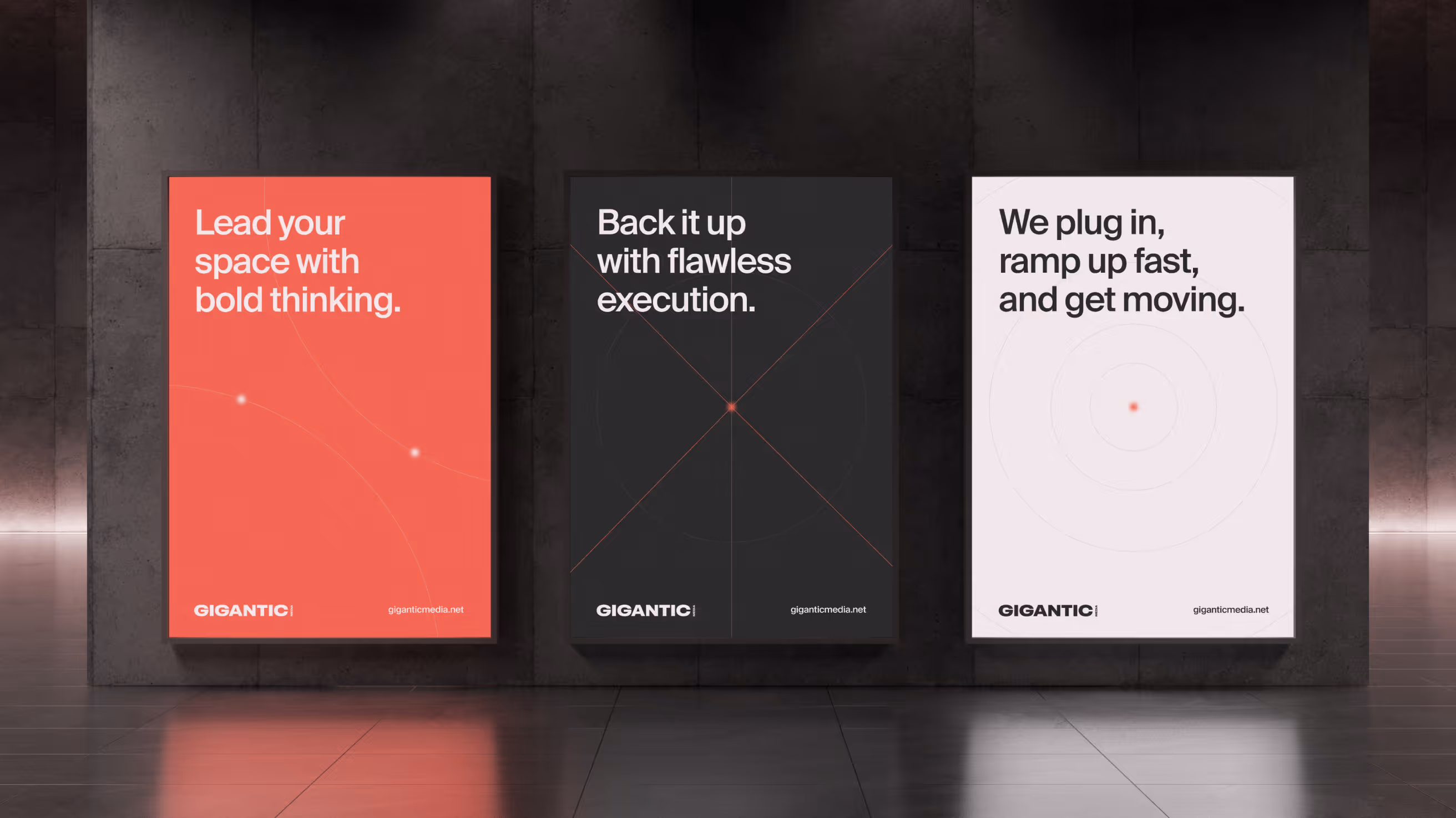
Next Case
Magic Receipt
Magic Receipt
Branding
Creative Direction
UX/UI
Aldebaran
Aldebaran
Branding
Creative Direction
UX/UI
Roots
Roots
Branding
Web Design
Wallnut
Wallnut
Web Design
Web Dev
Pixite
Pixite
Branding
Web Design
uSwap
uSwap
UX/UI
Creative Direction
GenAR
GenAR
Creative Direction
UX/UI
Fellow Art
Fellow Art
Branding
UX/UI
Web Dev
Tail Time
Tail Time
Branding
UX/UI
MetaMove
MetaMove
Branding
Creative Direction
Club Curran
Club Curran
UX/UI
Web Design
Web Dev
Nagish
Nagish
Branding
UX/UI
Creative Direction
Flinkwerk
Flinkwerk
Branding
Creative Direction
Digital Candy
Digital Candy
Branding
UX/UI
Product Design
Evollu
Evollu
Branding
UX/UI
Web Dev
Znuny
Znuny
UX/UI
Branding
Web Dev
Creative Direction
Westcode
Westcode
Branding
UX/UI
Creative Direction
MindCompass
MindCompass
Branding
UX/UI
Web Dev
Creative Direction
Tricky Knot
Tricky Knot
Branding
Web Design
Web Dev

Ready to move your project forward?

Step into the future of your brand. Reach out today and let's move forward together.
Black arrow pointing to the right.
Enter