Forwwward Studio © 2023

We are a skilled team of designers, passionate about elevating your digital presence. Exceptional design is the heartbeat of every successful business, and we take pride in matching your unique requirements with a team perfectly suited for your project.
Leave your details and we'll reach out to start moving forward.
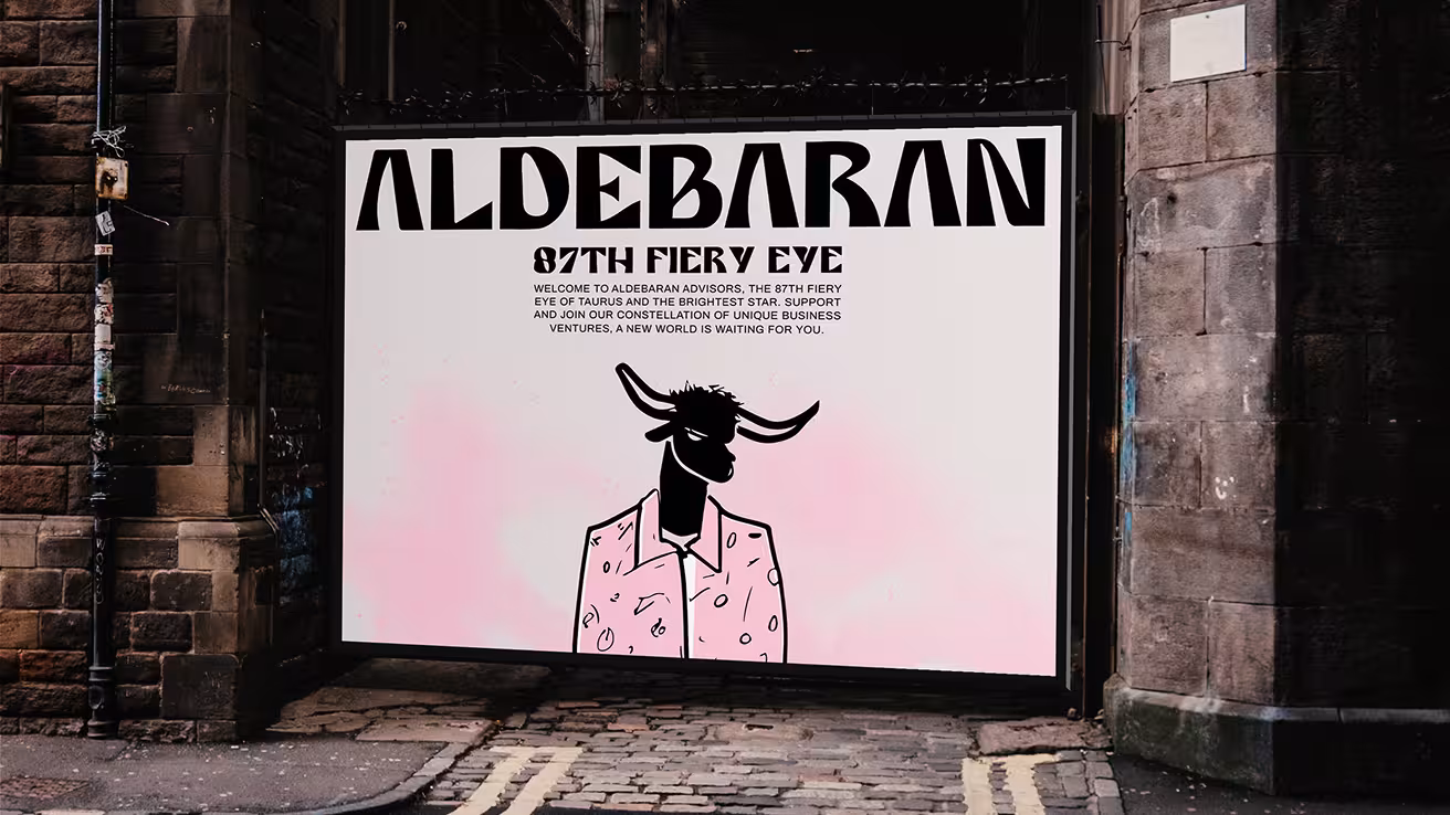
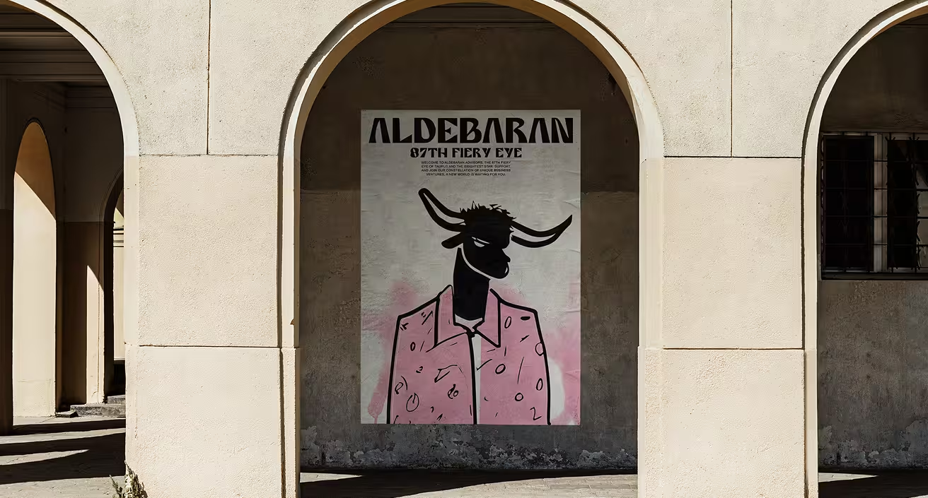
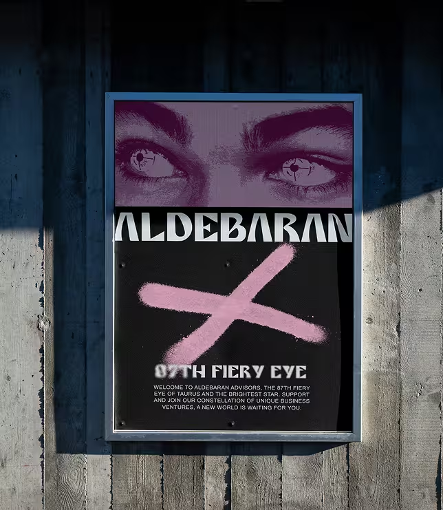
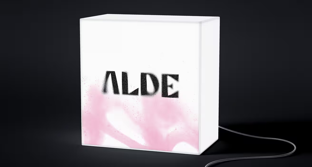
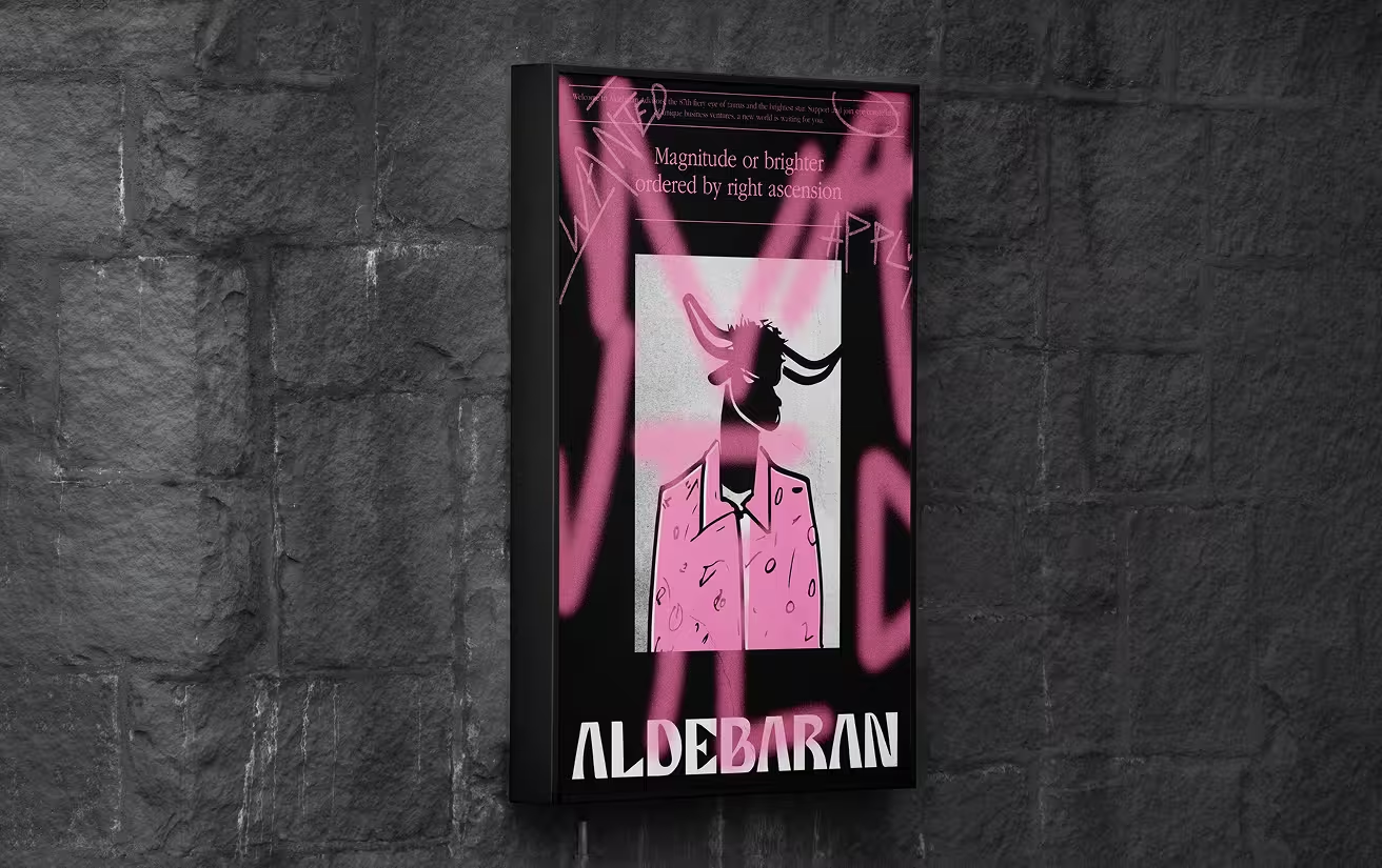
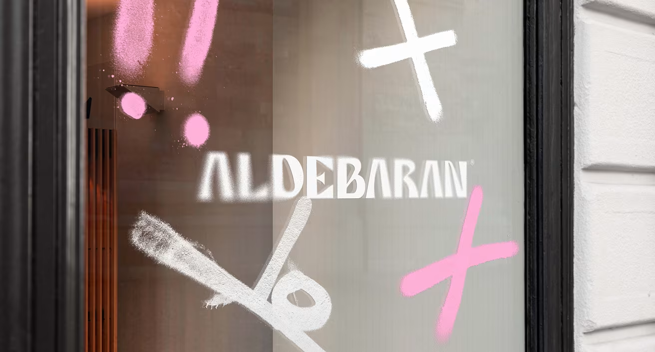
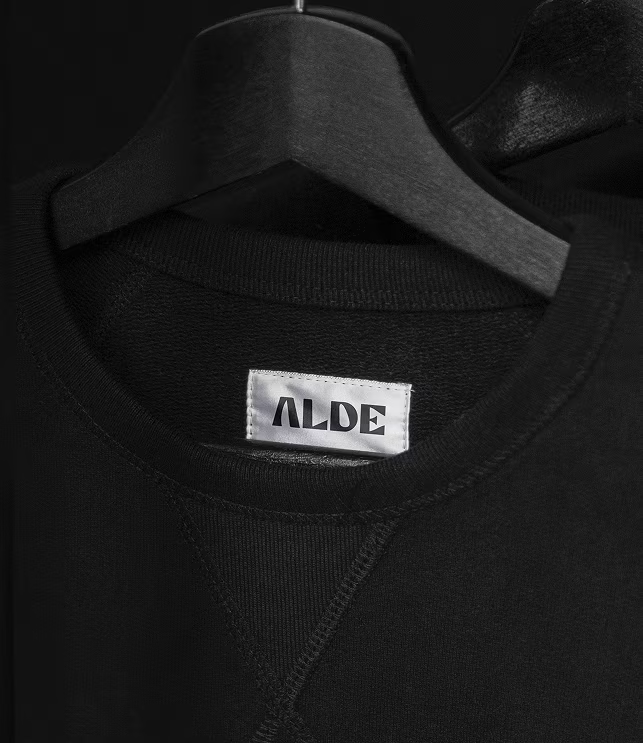
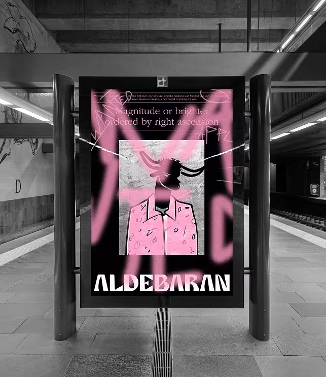
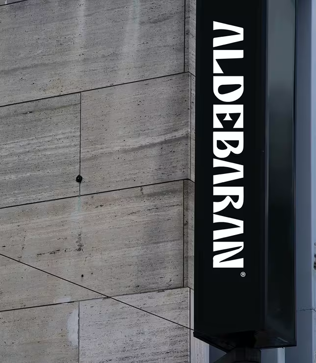
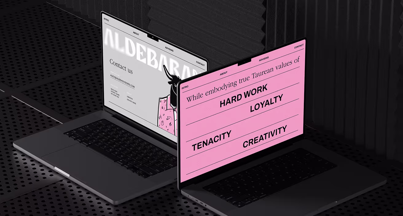
The visual language of Aldebaran balances sophistication with edge. A refined serif typeface conveys authority and clarity, while a bold pink hue disrupts the formality of a deep black backdrop. Together, these elements reflect the brand’s dual nature: strategic and expressive, focused and free.


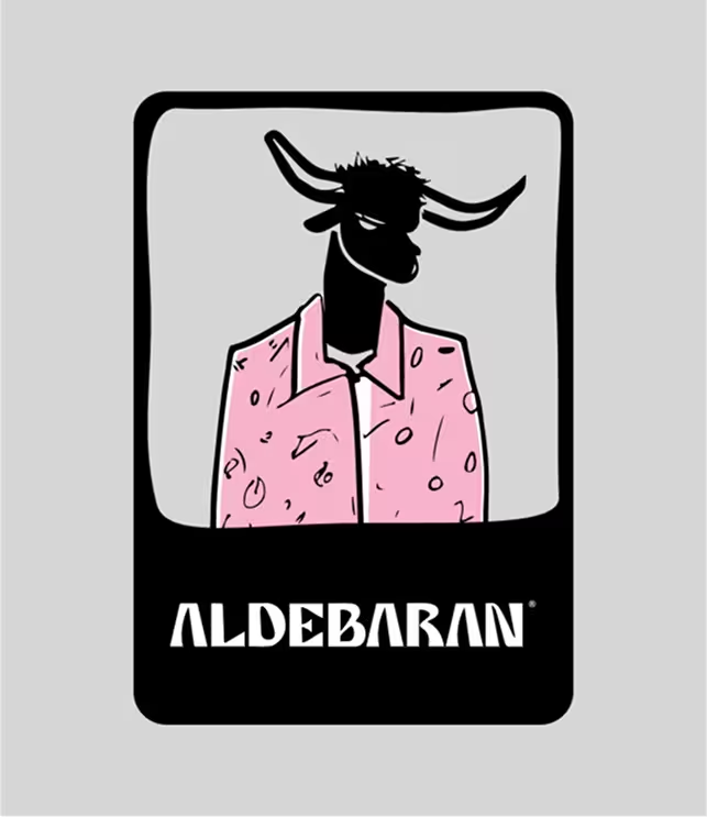
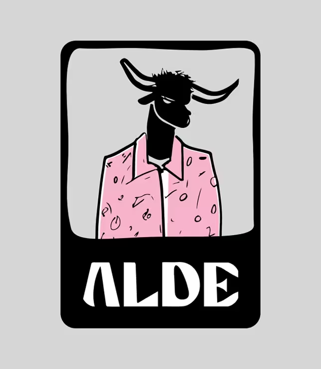
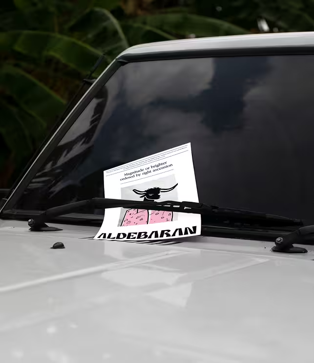
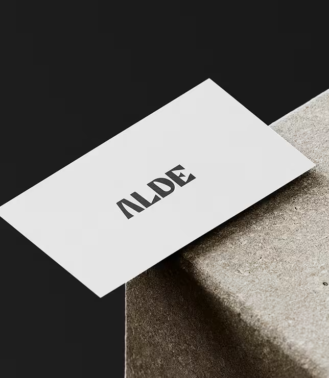
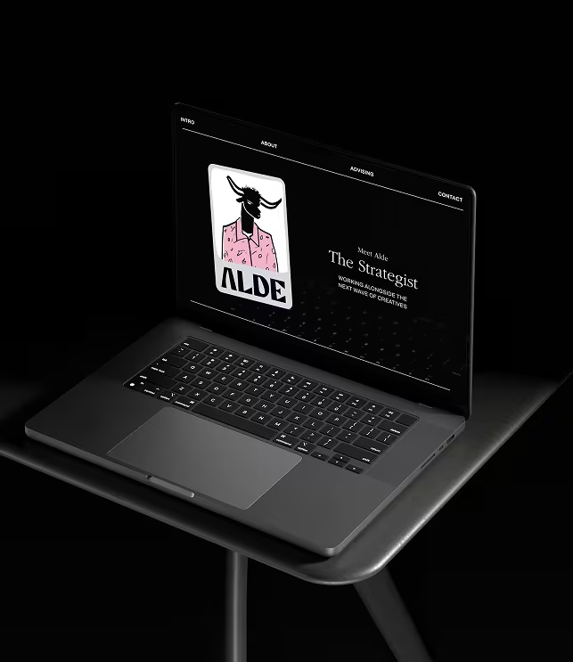
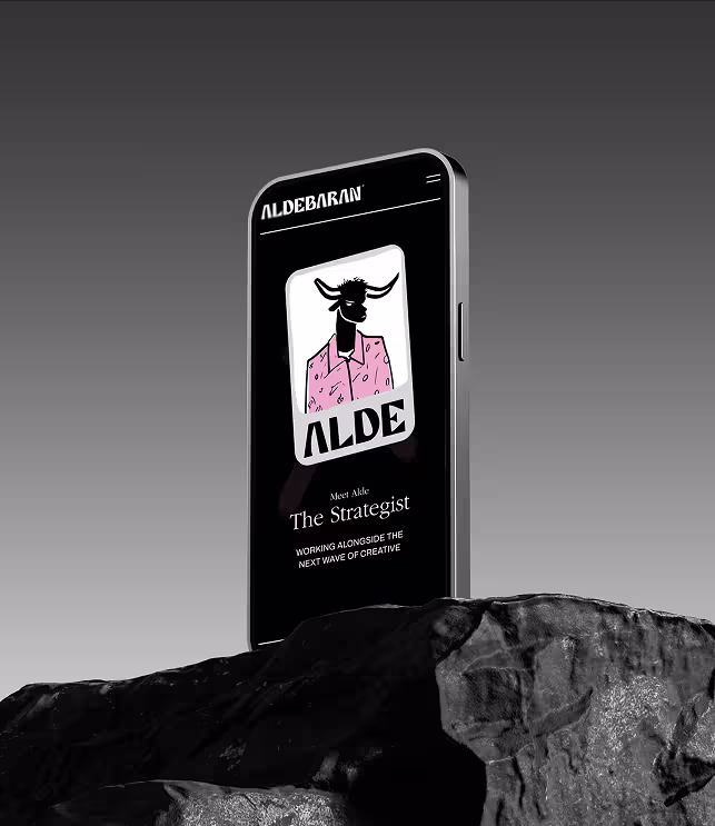
The Aldebaran logo is brought to life through Alde, the character, a stylized bull in a pink shirt with attitude. Alde is the brand’s persona: observant, bold, and quietly powerful. As both mascot and metaphor, Alde represents creative resilience and strategic presence — standing strong while moving with intent.
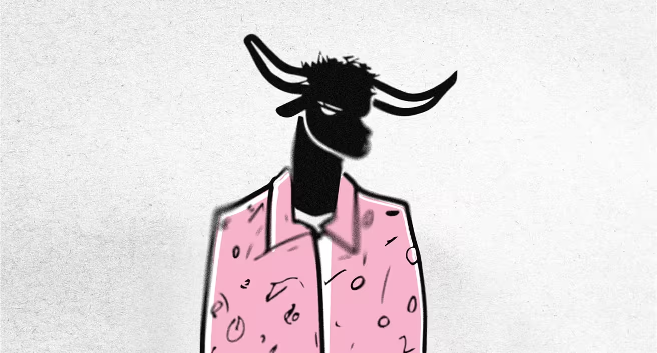
Aldebaran’s visual direction draws from the raw energy of street art and the expressive chaos of Basquiat, layered with a cinematic sense of framing and atmosphere. Hand-drawn elements clash intentionally with sharp grids and serif typography, creating tension between instinct and precision. It feels curated yet unpolished, like a storyboard scribbled in the margins of a manifesto. The result is a visual world that’s both alive and authored, where every frame feels like a still from a larger narrative in motion.
Aldebaran shows up as a partner, not a spotlight stealer. Whether in decks, social, or advisory sessions, the brand system is built to amplify ideas without overpowering them. Its voice is clear, its tools adaptable, and its design intentional.
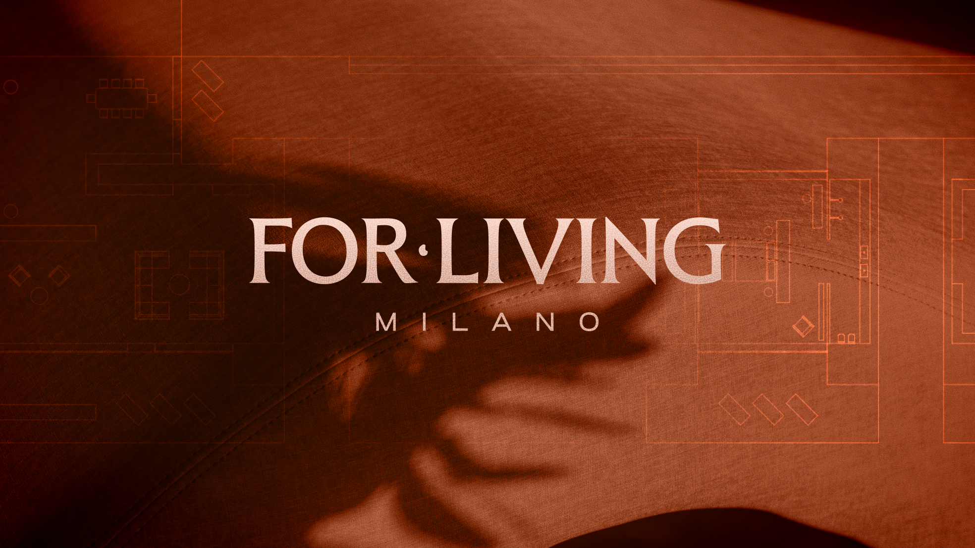
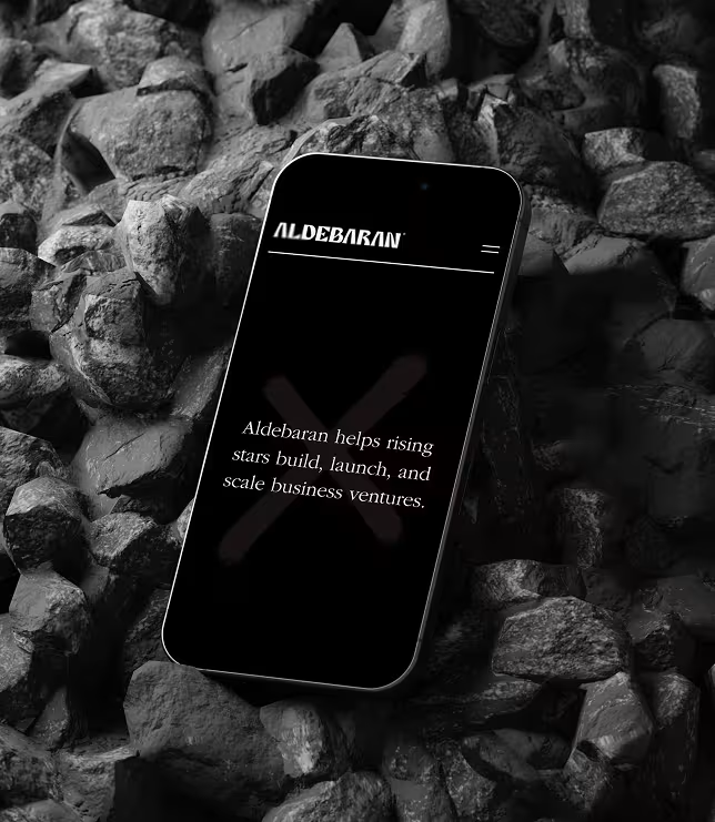
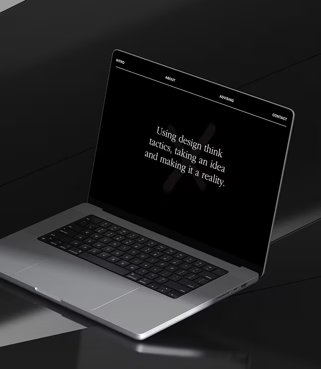
The Aldebaran website functions as a modern calling card: minimalist, confident, and magnetic. The clean black-and-white interface is punctuated by bold pink, echoing the brand’s balance of clarity and charisma. Navigation is seamless and editorial, guiding visitors through the mindset, method, and magic behind the studio’s work.

We help you shape it, build it, and make it matter.
We help you shape it, build it, and make it matter.