Most projects start with an existing website or brand. A direction, a mood board, a "we like something between X and Y." Botanic Garden had none of that. What it had was 13 songs.
Todd Logan and Lindsay Jones — playwright and composer — came to us with a musical they'd been developing for years. The brief, if you can call it that, was the songs. So we listened.
The creative challenge
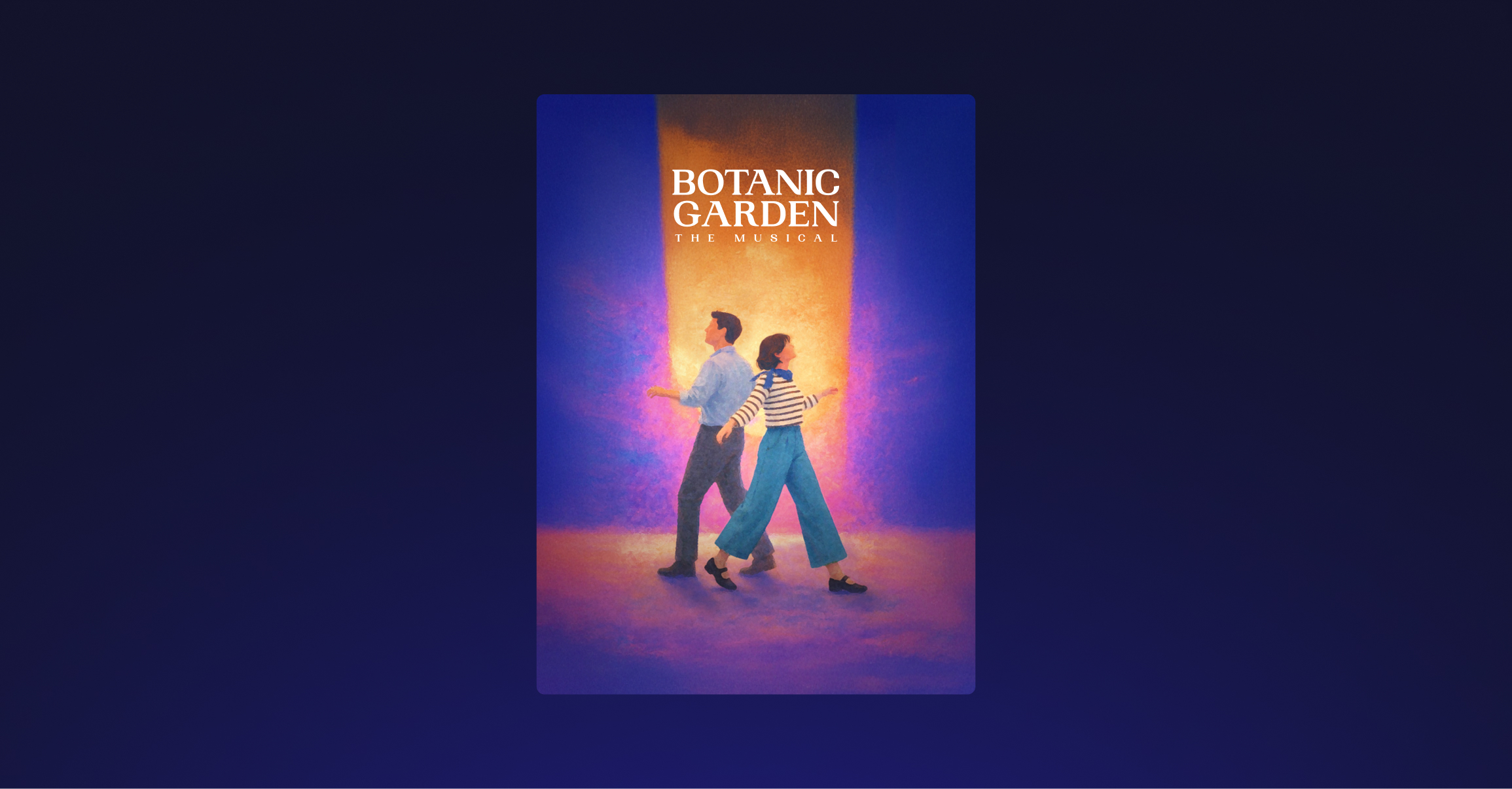
The musical lives in a tension that's genuinely difficult to visualize. It's about the heaviness of starting all over after decades with a life partner, but paired with a tone that’s so honest and open that it becomes comedic. One of the two characters is dead, but he's fully present, has opinions, and argues. How do you show that?
We also had a practical constraint: we couldn't show the characters' faces. This isn't a movie where one actress plays the character forever. Each venue that produces the show will probably cast their own actors, so the visual identity needed to work for anyone, anywhere in the world.
Hundreds of images and one instinct
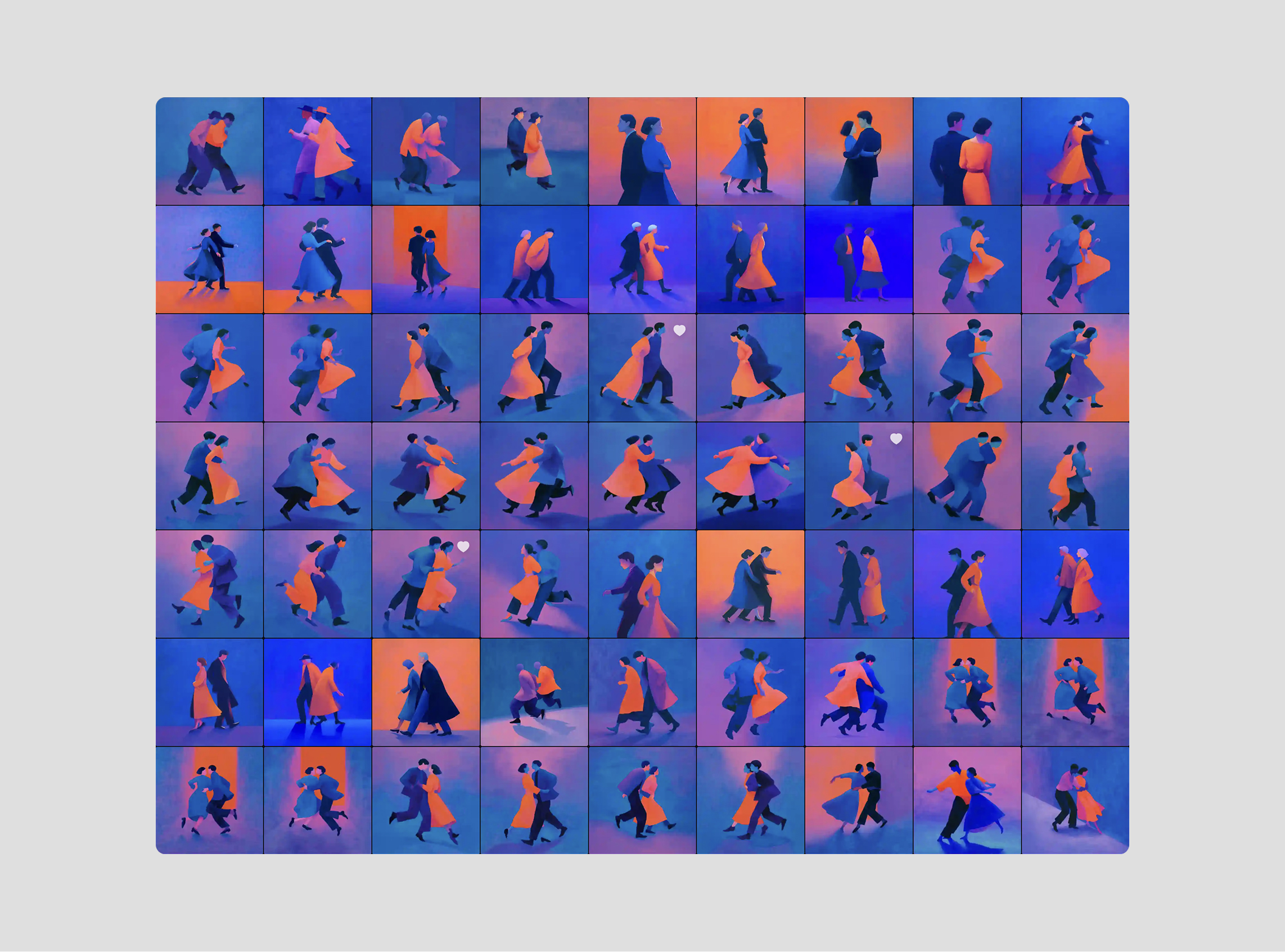
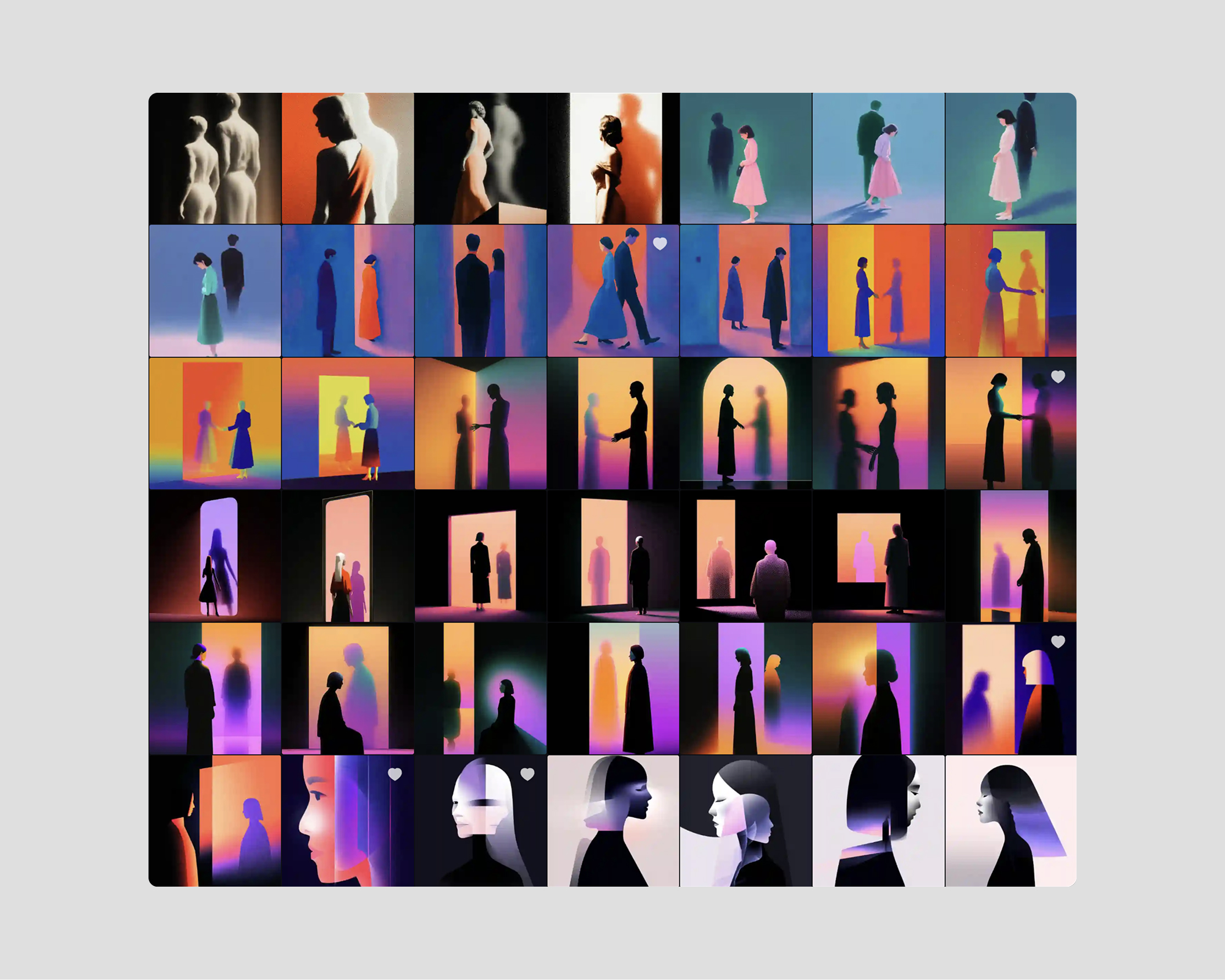
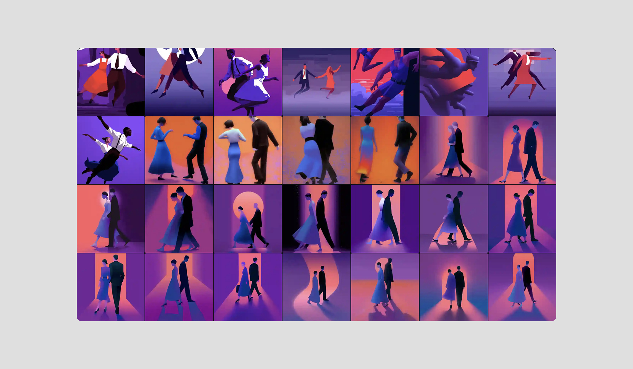
We used AI consistently in the exploration phase to test compositions quickly. We generated hundreds of images. Different arrangements of the two figures, different relationships between them, different ways of suggesting the tension of the piece.
What eventually clicked was a pose where the two figures looked like they could be dancing, or they could be walking in opposite directions. You couldn't tell. And the more we sat with it, the more that ambiguity felt like the whole show in one image. The entire musical is built on that dynamic: two people in constant back-and-forth, her saying something, him replying, him saying something, her pushing back. It's a conversation that sounds like a dance.
We showed that direction to Todd and Lindsay. They pushed back on things. We pushed back too. There were a lot of meetings where we'd go deep on whether something was working and why. The concept evolved slowly over those conversations until the final version felt right to everyone.
The visual identity
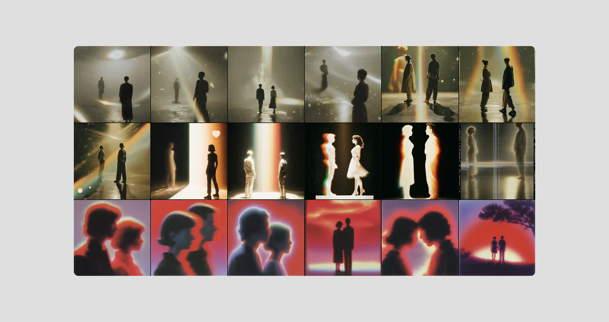
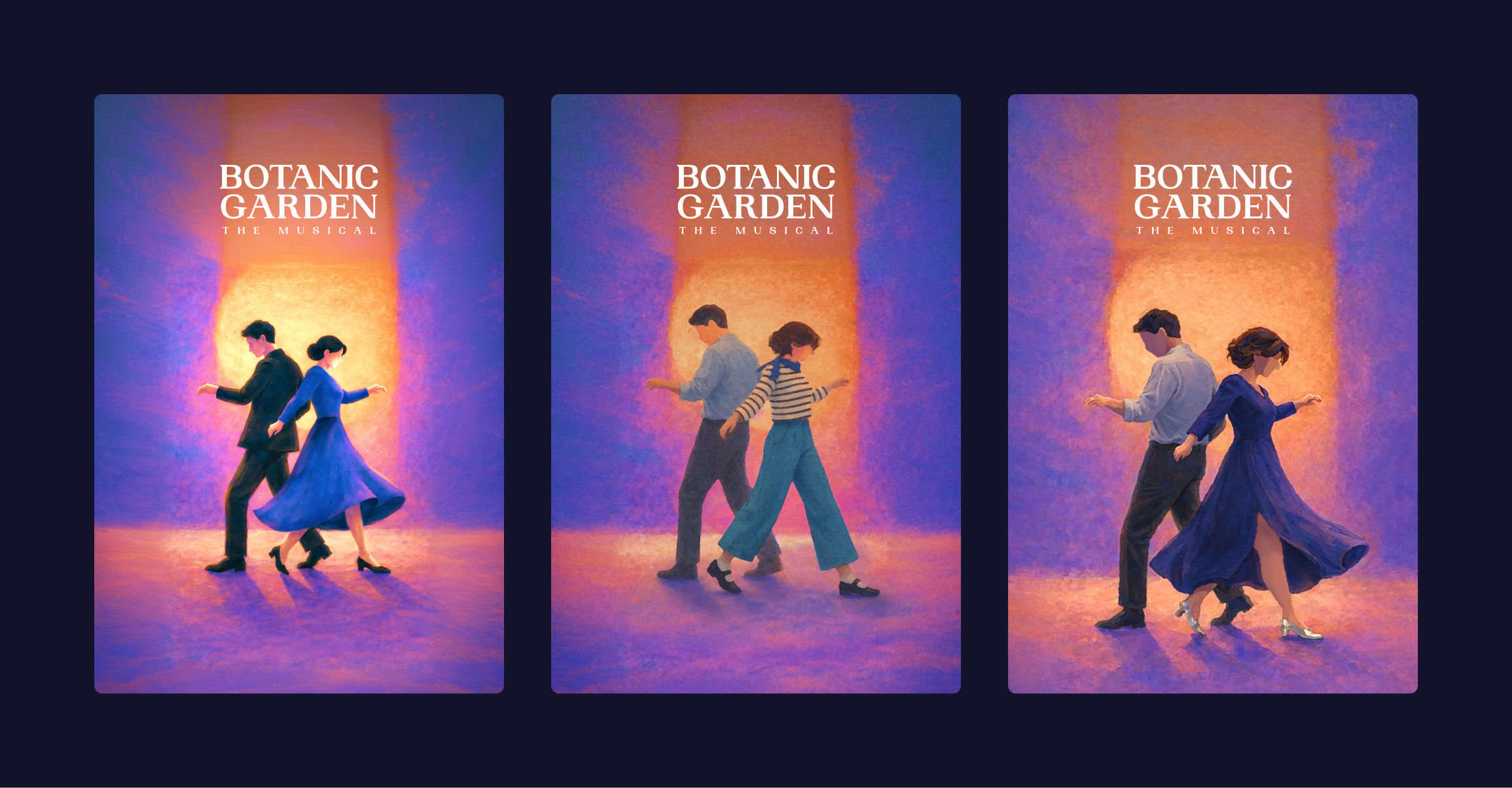
Once we landed on the concept, the work became more precise. We spent a lot of time on the details: the clothes, the hair, the way the two figures actually looked. The first versions had them in a suit and a dress, which felt a bit dated and too formal. We pushed it toward something more contemporary. The woman’s hair also went through a few rounds. Their heads were originally looking down, which made the whole thing feel too dark and sad, so we raised them. When the faces aren't visible, every other detail carries more weight.
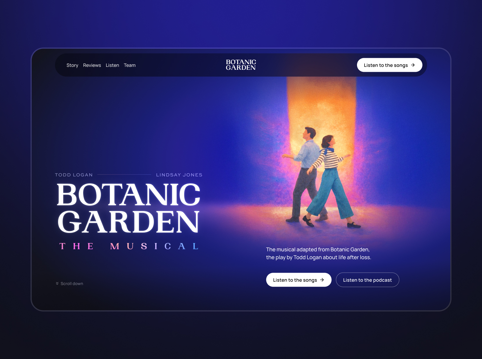
The typography was the next decision. We chose Woodland, a serif by Pangram Pangram. Something with formality and a bit of delicacy, which felt right for the subject matter: starting over, the weight of a life shared and lost. A sans-serif would have been too casual for that.
The color palette came from wanting it to feel like a live show. Something dramatic, something you'd see on Netflix. That warm orange at the center bleeding out into deep blues and purples at the edges connects to stage lighting, or the feeling of sitting in a dark theatre just as something begins. There's a tension in that contrast between warm and cool that felt musical to us, like the palette itself had some drama in it. We wanted the whole identity to feel alive, as if it’s already performing.
.png)
The website
The site exists primarily to attract producers and theatre companies that might want to acquire and stage the show. So, beyond showing the songs, it needed to make a clear case for why this is a smart production decision.
The pitch is essentially this: Botanic Garden is a small show that feels big. Just two actors, a minimal set, and a piano arrangement designed to sound fuller than it is. It's built to work in intimate venues. That's the argument the site makes, and it shows the songs up front to drive the point home.
The listening party
When the show had its listening party in New York, they needed something on screen to give the room a visual atmosphere while the audio played.
We took the background from the key visual and animated it with Gemini. We generated half a dozen short videos and edited them together into a one-minute seamless loop.
This project was different from most of what we do. There was no product, no interface, no established brand language to work with. Just a story, 13 songs, and a lot of discussions about what it all meant. We're glad we got to do it.
If you have a project that doesn't fit a standard category, we'd love to hear about it.